
LetsGo!
The Project
LetsGo! is an MVP Product Design aimed at helping people meet new friends in a new city and while making the in-person event experience better. LetsGo! solves for the Social Product Scenario below:
A startup company has launched a product that helps people meet new friends. Friends keep us company through the difficulties of our lives and help us grow, but when people move to a new city or town, fear and social anxiety can deter them from making new friends.
My Role
Tools
Timeline
UX / UI Designer
User Research
Prototyping
Interaction Designer
Usability Testing
Figma, Miro
3 weeks
The Problem
The number of people who say they are going to an event is significantly higher than the actual number of people who attend. On average, 20 percent of people who say they’re going actually end up attending events. What can be done to increase the conversion of accepted invites to event attendees?
The Ask
How can we help people who have social anxiety step out and make new friends?
The Outcome
LetsGo! is a digital social product that creates user experiences encouraging people to get out and do activities in-person. It provides users with comfort and ease social anxiety about attending an event, effective communication about an event and incentive to attend an event. Click into interactive prototype to view final designs
The Process
Starting with a personal pain point and talking to other users in the same situation, it led me to explore this problem and discover others throughout the social journey. I used the iterative process of Design Thinking to guide my decision-making. Phases included: Discovery, Design, Validate and Finalize.
Discovery
Empathize
Design
Define
Ideate
Prototype
Validate, Finalize
Test
Iterate
Phase 1: Discovery
Empathize
During this initial step, I analyzed and drew insights from the following methods:
-
Secondary Competitive Research
-
User Interviews
1. Secondary Competitive Research
I started with secondary research to learn about industry examples including Eventbrite, Facebook and Meetup. I reviewed the Sign Up flow for each platform and noted likes, dislikes and action items that I wanted to implement into my social product.


3. User Interviews
I chose 4 participants to interview. I conducted 20-minute interviews with 4 participants - 3 on Zoom and 1 in-person.
Video Interview
It’s easier to engage with people when I feel happy and comfortable in my environment.”
I'm not in school and live the freelancer lifestyle, so it’s harder to have organic opportunities to meet people.”
If there are people I know that are going that I like, that will increase the likelihood of me attending.”
Interview Insights
Phase 2: Design
Define
In helping to focus on the larger problems and synthesize my interview findings, I used the following methods to identify solutions:
-
Affinity Maps
-
User Personas
-
Problem Statements
1. Affinity Maps
I organized participant observations, quotes and thoughts on to post-it notes. I looked for larger common themes while grouping insights into the following categories:
-
Users
-
Problems/Need
-
Existing Solutions
-
Dependent
-
Technology
-
Expectations
-
Ideas
-
Process/Journey
-
Frustration/Pain Points
-
User Behavior/Psychology
-
Connection/Social
-
Engagement
-
Miscellaneous
View the full Affinity Map here.

2. User Personas
This user persona represents all the combined views of the participants that were interviewed.

4. Problem Statements
After defining the user personas, I began to frame my “How Might We” (HMW) Questions. Identifying the problem statements first was a crucial step in being able to find with solutions. These questions helped shape the Minimum Viable Product (MVP).
How Might We
Meet new people that they are likely to form a friendship with?
Reduce social anxiety and feel comfortable attending events?
Create a comfortable environment for people to socialize in?
Remember that they have signed up for an event?
Increase the likelihood of attendance at in person events?
Ideate
During this critical period in the UX design process, I worked on the following:
-
User Flows
-
Sketches & Wireframes
-
Style Guide
-
High Fidelity Mockups
1. User Flows
To show how the user will interact and complete tasks, I created common routes within the user journey. Below are two key user flows.
View the final Onboarding Flow here.
Flow 1
As a user, I want to sign up for an event.

Flow 2
As a user, I want to receive event reminders and a confirmation.

2. Sketches & Wireframes
From user flows, I created rough sketches. With insights from sketches, I created low fidelity wireframes to go with the red routes.
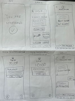
Wireflow 1
As a user, I want to confirm event attendance and receive reminders.

3. Style Guide
In order to create a cohesive visual identity, I created a style guide to use for a consistent design across the product.
Company Name

Font Family

UI Components
Icons

Color Palette
Primary, Secondary and Accent

Buttons

6. High Fidelity Wireframes
With a design system in place, I created high fidelity mockups and a prototype in Figma to make the product interactive. I conducted two rounds of usability testing with 8 participants. Testing uncovered pain points in the user experience and defined areas of improvement.

Welcome
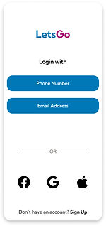
Login

Login
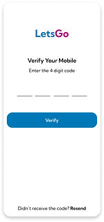
Login

Home
Phase 3 & 4: Validate, Finalize
Testing & User Insights
I conducted 8 moderated usability tests in two rounds of testing - 6 on Zoom and 2 in-person. Participants ages were between 32-55 years old and included included 1 male and 3 females located in various urban cities. All of the participants have used event apps / websites in the past year and have general interests and behaviors similar to the user persona.
All participants were able to complete user tasks successfully and provided actionable feedback. Key user insights include:
All Users:
-
Liked simple and minimalist look
-
Thought all critical event information was shown
-
Excited by personal and conversational copy
-
Liked fun / celebratory UX features
Most Users:
-
Didn't think chat feature fit into this context and would not use it
-
Would use this app
-
Would use the one-step verification feature when signing in
-
Would want to learn about other attendees
1 User:
-
Liked simple and minimalist look and feel of the app
-
Thought all critical event information was shown
-
Excited by personal and conversational copy
-
Liked fun / celebratory UX features
-
Suggested adding social icons into event page and email reminder
-
Suggested adding visual cues to create a realistic representation of event
-
Suggested adding an exclamation point to the logo
Iterations
After reviewing all feedback, I incorporated all changes into the final version of my prototype. The prototype illustrates a multichannel user experience which includes mobile application, email and text message.
Mobile Application
Issue

Solution

-
Updated logo to add more excitement
-
Added subtitle to create more context about app
-
Updated to a cleaner look to not distract user
-
Updated CTA buttons to create clear decision
pathways for user
Text Reminder
Issue

Solution

Reminder Email (mobile view)
Issue

Solution

-
Updated cover to venue photo to cross promote;
create expectation for the user -
Added social channel link in the copy to extend opportunities to discover content
-
Updated photo icons to be more easily clickable
-
Changed icon color to draw more attention
-
Added emojis to give a fun flare to create excitement and relatability for user
Final Designs
Click into the interactive prototype to view final designs. Or view the final prototype here.
Retrospective
Key Learnings
1. Less is more.
Throughout the design process, I wanted to make sure that all decisions were based on the users’ ease of use. Keeping a minimalist approach at the forefront of all designs helped to shape both the UI and UX and stick with the initial and central goal of creating a stress-free, uncluttered and delightful digital product. I used a more graphic intensive style rather than a text heavy design. I wanted to make sure that the user was not overwhelmed and was encouraged to engage.
2. Creating expectation leads to comfort.
One key insight I learned was to create realistic expectations which will lead to user comfort. The more information a user is given, in this case prior to attending an event, the more likely they will feel comfortable and inclined to make a decision about attending. My goal was to provide relevant and nice-to-have information, but deliver it in a way that was simple, approachable, digestable and enjoyable.
3. Iteration is key.
Keeping an open mind and not getting attached to a version of your product is key. Listening to and implementing the users’ feedback is a crucial part of evolving and improving the product. While it’s easy to get stuck on a specific design or user flow, the target user is ultimately who you are designing for, as they will be the one using the app the most. Don’t take feedback personally or get hung up on your own personal preferences during the iteration process.