
BoardSpace
The Project
BoardSpace is an online portal for volunteer directors and administrators of condos, HOAs, non-profits and charities. It aims to overcome the daunting task of looking after hundreds of documents, attending lots of meetings, preparing agendas, approving minutes and keeping on top of to-do lists by providing boards with the tools to get their work done more efficiently and in less time.
My Role
Team
Tools
UX / UI Designer
Pat Crosscombe, Founder and CEO of BoardSpace
Erin Palchak, UX/UI Designer
Alla Postulga, UX/UI Designer
Figma, FigJam, Zoom
Timeline
5 Weeks
The Problem
With the primary use as a cloud based web application, BoardSpace also has a browser based mobile version that provides accessible support for users that may not want to or be able to carry a computer to board meetings. However, users find the experience confusing and this version is not being utilized often. BoardSpace is seeking support to redesign key mobile features including: agenda, attendees, notes, tasks, documents and board information.
The Ask
How can mobile features be redesigned in a way that is easy and accessible for users?
The Outcome
I simplified the main navigation by focusing on features that users were prioritizing and created a clear distinction between the Meeting Minutes and Agenda.
Additionally, the mobile experience was revamped with improvements including:
-
Main navigation and menu options
-
Colors and web accessibility
-
User control and exit
-
Text alignment and hierarchy
-
Visual distinction
-
Style guide and design system
View Full Case Study here.
The Process
After a kickoff call with the client, I put together a project plan and work scope to set a clear timeline and expectations for deliverables. The plan included four phases: Discovery, Design, Validate and Finalize.
Considering the target user and analyzing customer feedback helped into the mindset of the Board Director position, which was the requested perspective to prioritize design changes for. I chose the iterative process of Design Thinking to guide my decision-making.
View full Project Plan here.
Discovery
Empathize
Design
Define
Ideate
Prototype
Validate, Finalize
Test
Iterate
Phase 1: Discovery
Empathize
During this initial step, I analyzed and drew insights from secondary research including:
-
Target User Persona
-
Basic Style Guide
-
Competitor and Board Software Industry Insights (via Discovery Call)
-
Initial MVP Usability Test Reports
-
User Reviews from Capterra

Phase 2: Design
Define
In order to focus on larger problems and synthesize findings, the following methods were used to identify solutions:
-
Existing Wireflows
-
Target User Persona
-
Problem and Solution Statements
-
User Stories
1. Existing Wireflows
To gather a holistic view of the mobile experience, I reviewed and documented the existing wireflows. This helped in learning product functionality and brought pain points to the forefront. I looked for differences between the iOS and Android experiences as well.
View all Existing Wireflows for mobile here.

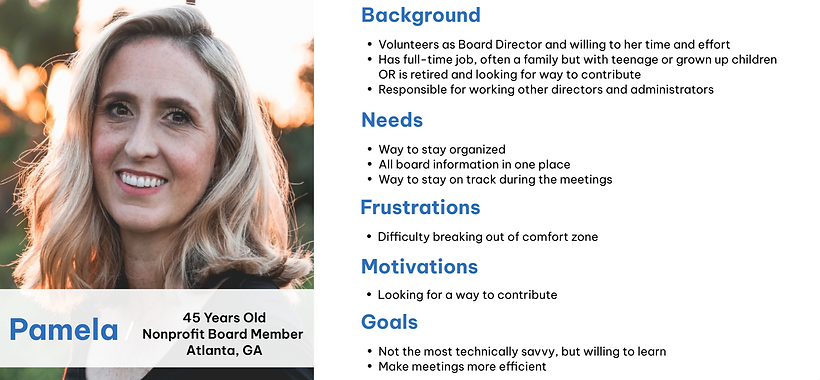
2. Target User Persona
This target user persona was provided by the host company. All testing subjects met this criteria.
3. Problem and Solution Statements
After receiving the target user persona, I framed the problem statements by asking the “How Might We” (HMW) Questions. Identifying the problem statements first was a crucial step in being able to formulate a solution statement.
How Might We
Reduce feelings of stress and being unorganized as board director?
Help users prepare properly for a board meeting?
Help users be informed of all meeting information, past or present?
Help users feel connected to the organization at all times?
Possible Solution Statement
Redesign the mobile browser experience, with a focus on agenda and meeting features, in a way that allows users to feel connected to the organization, informed on all meeting details (past or present) and prepared for the upcoming meeting.
4. User Stories
To stay aligned with user-centered design, I took the solution statement and defined tasks the user would want to complete within the mobile experience. These essential features and tasks aimed to shape the Minimum Viable Product (MVP) and user stories for mobile.
I want:
So that:
As a Board Director:
To view the agenda on my phone.
To view an upcoming meeting on my phone.
To view a previous meeting on my phone.
I am informed about meeting topics.
I am informed on when / where meeting will take place, find details and outstanding items.
I stay informed on when / where meeting took place, details and outstanding items.
Ideate
This part of the UX design process was critical to Phase 2 from the Project Plan. During this time, I worked on the following:
-
Audit
-
Sitemap
-
Design Recommendations
-
Low Fidelity Wireframes
-
Style Guide
-
High Fidelity Wireframes
1. Audit
For the audit, I examined existing user flows and relevant mobiles features while considering:
-
Nielsen Norman Group Usability Heuristics
-
Universal Principles of Design
-
ADA Accessibility Standards
To keep thoughts organized, collaborative, visual and easy to access, I created a Figma file for everyone to contribute comments in one place. This working style helped to identify final design recommendations and recurring themes in a timely and efficient way.

Sample of UX Audit
2. Sitemap
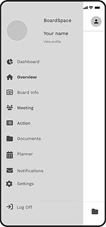
Mapping out the current mobile sitemap brought clarity the existing user flow. This process helped in creating an updated version with one of the major design recommendations - simplify the main navigation.

Current Mobile Sitemap

New Mobile Sitemap with Recommendations
3. Design Recommendations
After the audit, I reviewed and consolidated insights and created high level design recommendations.
Main Navigation and Menu
-
Reduce main navigation options; 8 icons to 3 icons
-
Reconfigure remaining content into hamburger menu
-
Rename select main navigation areas
Colors and Accessibility
-
Replace icon color and selected state
-
Ensure all new color combinations are compliant with web accessibility standards
User Control and Exit
-
Insert a back button function for selected user flows
-
Ensure user can go back and/or exit anytime during the user experience
Alignment and Hierarchy
-
Define text alignment and hierarchy standards
-
Create a cohesive feel throughout mobile experience
Reduce text and apply a minimal layout
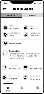
Visual Distinction
-
Create visual distinction between meeting minutes and agenda tabs
-
Create clear, clickable defined areas for sections
-
Reword descriptions within sections
Style Guide
-
Recreate style guide with a universal design system and guidelines
4. Low Fidelity Wireframes
Due to the time constraint and the existing wireflows, the design recommendations were implemented into low fidelity wireframes.
Hamburger Menu

Home Page

Attendees
Minutes

Agenda
5. Style Guide
To create a cohesive visual identity, the initial style guide provided by BoardSpace was recreated. The goal was to establish a consistent design system across mobile. All designers collaborated in choosing font sizes, icons, components and color palette.
Color Palette

Typography
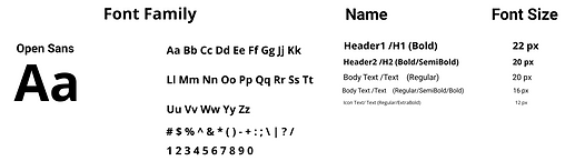
Icons

UI Components

6. High Fidelity Wireframes
With a design system in place and an initial round of feedback from the client, adjustments were made before solidifying high fidelity wireframes and prototype screens for testing. I updated select secondary colors to meet web accessibility standards (see example below).

Hamburger Menu
Original
Orange
#FF8800
Original
Green
#5DB798

Home Page
Accessible
Orange
#E07800
Accessible
Green
#479E81

Attendees

Attachments

Agenda
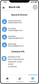
Board Info

Minutes
Prototype
The prototype was created to transform the project into an interactive state. Click below to view.
Phase 3 & 4: Validate, Finalize
Test
I conducted two of the five moderated usability tests - one with who was a current user and one who was a first time user. For recruiting, the client connected the group with three participants. The other two were found through personal networks, one of which I recruited myself. I wrote and edited our testing script.
View the full Testing Script here.


Script Excerpt
Key Findings
The project goal was to provide user with ease and accessibility in the mobile experience, which include finding all related meeting information in real-time and creating an experience that translates from desktop to mobile. I wrote and edited our testing report.
View the full Testing Report here.
Issue #1
Users did not know they were on the Minutes page when they reached that page.
Issue #2
Once on the Home page, it was not clear that ‘Next Meeting’ and ‘Action’ were clickable.
Issue #3
In bottom navigation, the ‘Board Info’ verbiage was confusing or misleading.
1 User who thought items on Home page were not clickable.
2 Users who thought 'Board Info' header was misleading.
4 Users who had difficulty or hesitation with the Minutes page.
1 User who could not find Agenda area of the site.
Iterate
After reviewing all feedback, the group iterated on final versions of High Fidelity Wireframes to deliver to the client. Below are examples of changes that were implemented:
Issue #1
Before
Confusion on page location
After


-
New landing page to separate Minutes, Agenda and Attendees page options
-
Tab bar filled in with blue and text enlarged/bolded to create visual distinction between tabs
Issue #2
Before

Confusion on clickability
After

-
Drop shadow added to Next Meeting and Ongoing Action items
Issue #3
Before

Confusion on verbiage
After

-
Icon verbiage on main navigation changed from ‘Board Info’ to ‘Contacts’
Retrospective
Key Learnings
This project allowed me to balance varying opinions, working styles and internal and client-facing expectations, in addition to meeting objectives in the project brief. I experienced a realistic work setting and got to work on and solve for a live product. As an emerging designer, this gave me a sense of purpose, excitement and confidence.
1. Underpromise and over deliver.
Managing client expectations is essential to success. With limited time, prioritizing mobile features was key. We identified crucial problem areas and just solved for those. Setting expectations upfront allowed for high quality solutions, organized presentations and being able to surprise and delight our client.
2. Find your groove.
Navigating various work styles and identifying each designers strong suit helped the group become efficient fast. Having a consistent time and a place to discuss ideas and concerns helped us to collaborate, iterate and keep the process moving. We found what worked for us.
3. Simply listen.
While it can be easy to get caught up in our own personal opinions, it is important to remember that the user comes first. The simple act of listening - whether to the client or user - will provide you with critical information on how to evolve or not evolve the product. By listening and observing, the designer will uncover specific emotions, usability issues and desired product improvements.
4. Less is more.
Sticking to a minimalist approach guided a pivotal design recommendation - reduce and simplify the main navigation. In the provided state, the navigation was cluttered with 8 features - some of which were not apparent to the user that they existed. By reducing options to the 3 critical features in the bottom navigation, it allowed users to focus on what they were already seeking.
5. Delivering value is essential.
Apart from the design process and group collaboration, delivering value to the client is the goal. To ensure this, we created realistic recommendations using similar UI elements and related user flows. We did not attempt to reinvent the wheel, but rather optimize and simplify. Select recommendations are currently in development and expected to go live Fall 2023.